PHOTO SHOOT FOUR:
Below is the contact print for my fourth photo shoot: this is a development from my first three photo shoots based around my theme of isolation. In this photoshoot I placed my subject in a completely different landscape in order to craete a different set of images, still taking inspiration from Andy Ellis based on the colour that I use within my images. I have chosen a few of the images to edit in various styles in order to convey different emotions for each image.
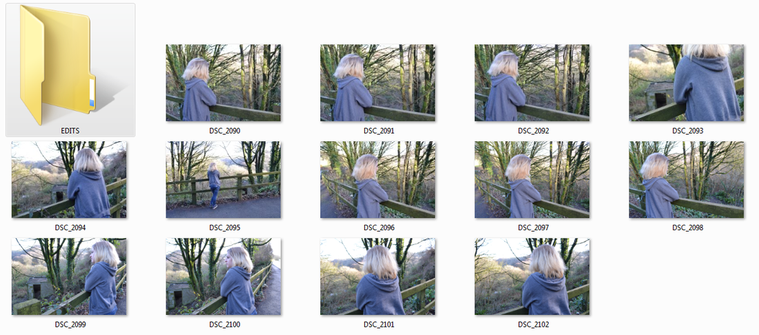
PHOTO ONE:
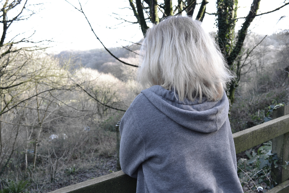
In this image I used the technique that I have used in previous photo shoots where I desaturate the colour of the image to give a washed out and faded look to the final outcome, representing the emotions that the subject is feeling within the image. Sadness, loneliness and and a feeling of loss are the main emotions that I explore within my theme of isolation and I feel that I have conveyed each of these well within my images. The positioning and body language of the subject suggests a very closed set of emotions and suggests that the subject is not comfortable in her isolated location.
The subject is the instant focal point: the framing of this shot shows that it is a mid shot so the body and head takes up the majority of the frame. I was then able to draw the viewers attention towards the clearly isolated landscape by allowing them to look at the positioning of the subject and see that she is looking out towards the forest aswell, encouraging the viewer to look that way. I think the loss of contrast and colour adds to the overall atmosphere of the image, accentuating the emotions that the subject is feeling and conveying the theme of isolation easily to the audience. I ensured that I destaurated the colour in this piece as I found the bright greens meant that the audience got a feeling of happiness rather then sadness and I wanted to remove this element from my photograph to make sure that the viewer saw the image in the way that I wanted them to see it.
The subject is the instant focal point: the framing of this shot shows that it is a mid shot so the body and head takes up the majority of the frame. I was then able to draw the viewers attention towards the clearly isolated landscape by allowing them to look at the positioning of the subject and see that she is looking out towards the forest aswell, encouraging the viewer to look that way. I think the loss of contrast and colour adds to the overall atmosphere of the image, accentuating the emotions that the subject is feeling and conveying the theme of isolation easily to the audience. I ensured that I destaurated the colour in this piece as I found the bright greens meant that the audience got a feeling of happiness rather then sadness and I wanted to remove this element from my photograph to make sure that the viewer saw the image in the way that I wanted them to see it.
PHOTO TWO:
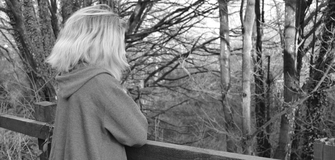
I incorporated the black and white editing technique into this image as I wanted to create a big impact on the viewer which I managed to accentuate through the cropping and the positioning on the subject in the frame. The longer, more rectangular shape of this image gives a bigger impact to the viewer when they initially view the image as it is a more striking shape and it is not one that the viewers are likely to see often: this would be the traditional shape without cropping. I think that a mixture between that element and the black and white editing creates a strong image both emotionally and visually: the trees in the background are blurred which automatically makes the subject the focal point along with the fence which is also in focus.
I chose to edit the image in black and white as I wanted the viewer to instantly view the image and think of a negative side of isolation but to then analyse the more open body language of the subject and the beauty of the landscape and see a side of isolation that is peaceful and tranquil. These emotions are a stark contrast against the colours within the image as you would usually expect a colourful and bright image to go with these emotions but I wanted to create this contrast to confuse the viewer intially but to make a visually beautiful image.
I chose to edit the image in black and white as I wanted the viewer to instantly view the image and think of a negative side of isolation but to then analyse the more open body language of the subject and the beauty of the landscape and see a side of isolation that is peaceful and tranquil. These emotions are a stark contrast against the colours within the image as you would usually expect a colourful and bright image to go with these emotions but I wanted to create this contrast to confuse the viewer intially but to make a visually beautiful image.
PHOTO THREE:
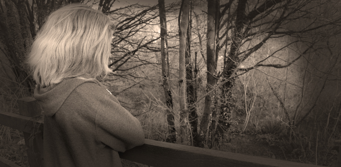
This image is edited in a very different way from the other images: I have created my own shadows to add another element to the image and edited with photo filters to give the sepia tones to convey a different sort of emotion when looking at the image. I used the brush tool to paint on the image with black where I wanted the shadow to go and then changed the opacity of this layer so that it looked like a shadow: I did this so that I could create a much darker atmosphere from within the image and convey a series of darker emotions. This was insinuating that the subject was clouded in her own mind and didn't know what to think so turned to isolating herself to get some peace and to try and forget about the bad things that were going on in her life.
The composition of this image was very simple but I used the cropping tool to create another longer, rectangular image to give a bigger impact on the audience. I have positioned the subject on the far left of the image so that she is looking out at the right side of the image, allowing the viewer to do the same and look out at the landscape around her. I have edited the image in the sepia tones to make the whole image look very dull and dark, I thought that I would experiment with a different way to create this kind of atnosphere without using black and white. I think the effect that I have created is very successful as it creates a different, darker mood for the audience to see and contrasts very well against the rest of my photographs.
The composition of this image was very simple but I used the cropping tool to create another longer, rectangular image to give a bigger impact on the audience. I have positioned the subject on the far left of the image so that she is looking out at the right side of the image, allowing the viewer to do the same and look out at the landscape around her. I have edited the image in the sepia tones to make the whole image look very dull and dark, I thought that I would experiment with a different way to create this kind of atnosphere without using black and white. I think the effect that I have created is very successful as it creates a different, darker mood for the audience to see and contrasts very well against the rest of my photographs.
