CONTACT PRINTS:
I wanted to experiment with the traditional dark room method of Contact printing with my own images to reflect a series of issues by layering images and text onto eachother. I also wanted to experiment with ways to develop the images such as the time to leave it in the developer and the way to apply the developer to form interesting textures and patterns within the image.
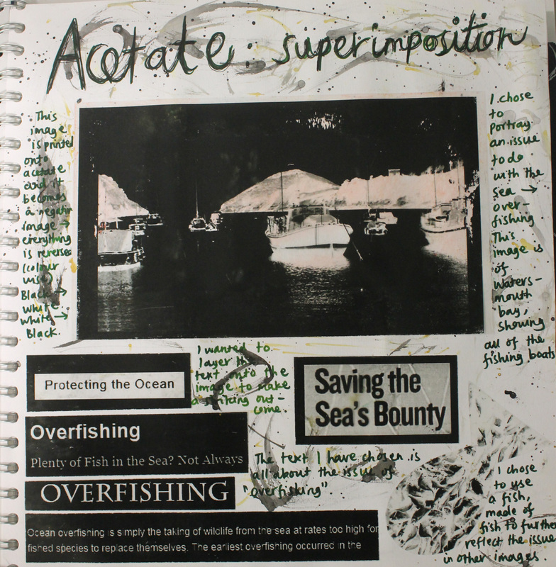
This image is printed onto acetate and it becomes a negative image - everything is reverse (colour wise) so the black areas would appear as white and the white areas would appear as black in the original image. I chose to portray an issue to do with the sea - overfishing. This image is of Watersmouth Bay, showing some of the fishing boats in the water. I wanted to layer the text onto the image to make a striking outcome. The text I have chosen is all about the issue of "overfishing". I also chose to use a shape of a fish, made of of smaller fish to further reflect the issues in the other images.
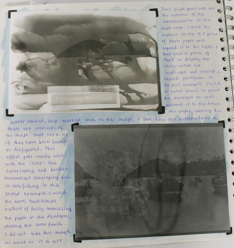
These final print outs are the outcomes of my experimentation in the dark room. I used the acetate on top of a piece of photo paper and exposed it to the light. I then used a piece of text to display the issue within the landscape and created a layered photogram. In the first example I used a paint brush to paint the developer on and allowed it to drip down the paper, causing the water stained, drip marked look to the image. I love how this outcome looks as if there are elements of the image that have been burnt or disfigured. This effect goes really well with the issue: the deteriorating and broken environment developing due to overfishing. In the second example I used the more traditional method of fully immersing the paper in the developer, causing the even finish. I do not like this image as much as it is not...
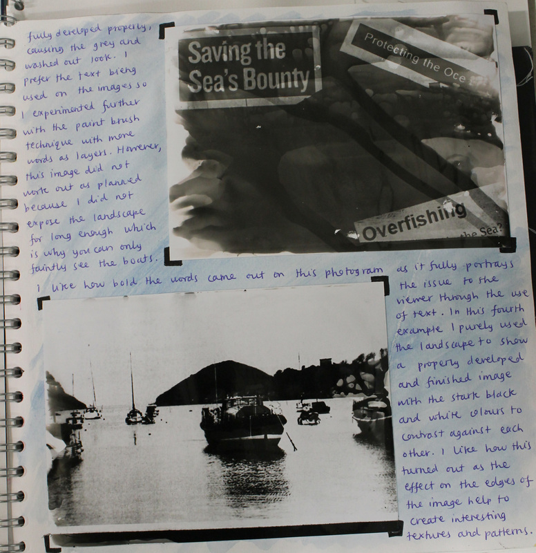
...fully developed properly, causing the grey and washed out look. I prefer the text being used on the images so I experimented further with the paint brush technique with more words as layers. However, this image did not work out as planned because I did not expose the landscape for long enough which is why you can only faintly see the boats. I like how bold the words came out on this photogram as it fully portrays the issue to the viewer through the use of the text. In this fourth example I purely used the landscape to show a properly developed and finished image with the stark black and white colours to contrast against each other. I like how this turned out as the effect on the edges of the image help to create interesting textures and patterns.
FINAL IMAGE DEVELOPMENT:
Final Image Development (Issues and Processes):
Processes: Inkodye, Cyanotype, Contact Print, Screen Print, Superimposition on Photoshop
Issues: Pollution, Global Warming, Over-Population, Homelessness, Littering, Urban Decay, Graffiti, Bullying, Arson, Vandalism
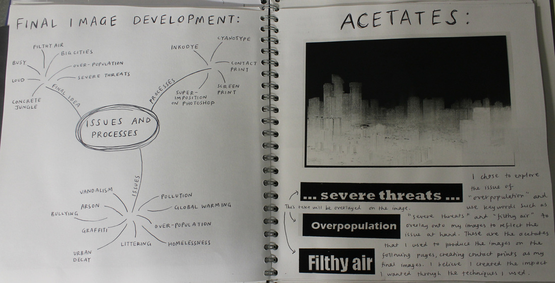
Final Idea: Severe Threats, Over-Population, Big Cities, Filthy Air, Busy, Loud, Concrete Jungle
I chose to explore the issue of "Over-Population" and use keywords such as "severe threats" and "filthy air" to overlay onto my images to reflect the issue at hand. These are the acetates that I used to produce the images on the following pages, creating contact prints as my final images. I believe that I created the impact I wanted through the techniques I used.
Processes: Inkodye, Cyanotype, Contact Print, Screen Print, Superimposition on Photoshop
Issues: Pollution, Global Warming, Over-Population, Homelessness, Littering, Urban Decay, Graffiti, Bullying, Arson, Vandalism
Final Idea: Severe Threats, Over-Population, Big Cities, Filthy Air, Busy, Loud, Concrete Jungle
I chose to explore the issue of "Over-Population" and use keywords such as "severe threats" and "filthy air" to overlay onto my images to reflect the issue at hand. These are the acetates that I used to produce the images on the following pages, creating contact prints as my final images. I believe that I created the impact I wanted through the techniques I used.
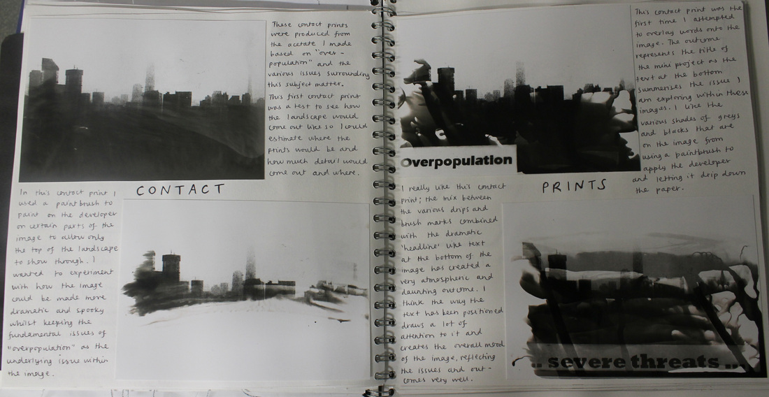
These contact prints were produced from the acetate I made based on "Over-Population" and the various issues surrounding this subject matter. The first contact print was a test to see how the landscape would come out like so I could estimate where the prints would be and how much detail would come out and where. In the second contact print I used a paint brush to paint on the developer on certain parts of the image to allow only the top of the landscape to show through. I wanted to experiment with how the image could be made more dramatic and spooky whilst keeping the fundamental issues of "Over-Population" as the underlying issues within the image. This contact print was the first one that I attempted to overlay words onto the image. The outcome represents the title of the mini project as the text at the bottom summerises the issue I am exploring within these images. I like the various shades of grays and blacks that are on the image from using a paintbrush to apply the developer and letting it drip down the paper. I really like the last contact print; the mix between the various drips and brush marks combined with the dramatic 'headline' like text at the bottom of the image has created a very atmospheric and daunting outcome. I think the way the text has been positioned draws a lot of attention to it and creates the overall mood of the image, reflecting the issues and outcomes very well.
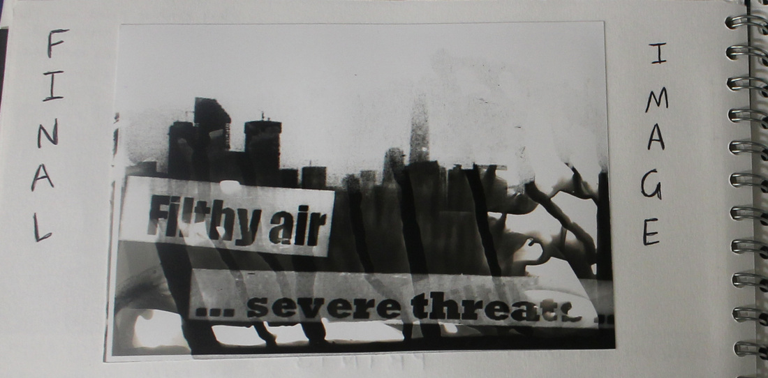
This is the final outcome from this issue that I was exploring around the theme of "Over-Population". I thought of various words and phrases that related to this issue and printed them onto acetate to allow me to layer the images onto one another and create a textured image with various different tones and patterns within it that mocked the look of deterioration and decay within the skyline image that I used. In this final image I used the striking phrases of "filthy air" and "severe threats" to strongly reflect the issue through the language of the photograph. I then used the paintbrush technique to brush the developer on and allowed it to drip down the image to cause these darker streaks that I thought reflected dirty water and allowed the interesting patterns to form on the side of the image. I think this gives a striking look to the image and I am very pleased with the overall outcome. I want to experiment further with different methods of applying the developer to allow me to develop my method of application to make a simple image gain depth and texture which would then make it more interesting to look at.
FURTHER EXPERIMENTATION WITH DEVELOPMENT PROCESSES:
The process of creating a contact print is a method that I enjoy and I love creating different effects and seeing the various outcomes that can be made through this traditional method of photography. I found that you can develop the images in a variety of ways by changing how you apply the developer onto the paper through my last series of contact prints and I wanted to experiment with this element further to create interesting patterns and textures within the final outcome. I found the best way to do this was to use a paintbrush to either paint the developer onto the paper or to flick the developer onto the paper with the brush: this creates the interesting outcomes that you can see in the contact prints below.
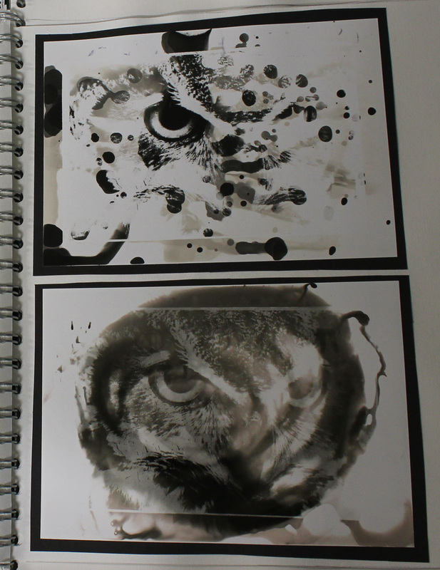
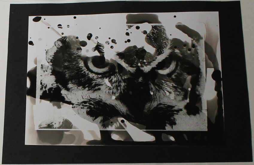
In the first contact print that I created I experimented with flicking the developer onto the paper and letting it drip down the page, creating the droplets that have developed quickly and the long, streaky lines that have created an absract atmosphere to the image. This process enabled me to reveal specific parts of the image that I wanted the viewer to see instead of revealing the entire image by using the traditional method of placing the entire piece into the water. I like the outcome of this piece as the darker areas show off the detail in the image very well whereas the lighter areas of the image, where it has not developed as much, give off a faded effect which adds to the overall atmosphere of the image. I like this faded effect that appears on all of these experimentations as I feel it creates an eerie and creepy element to the final image, giving the illusion that the image has been burnt and slightly tarnished over a long period of time.
I chose to use a different method with the second contact print: I painted the developer onto the page in a circular motion that was aimed at the most detailed part of the image. I think that this effect did not work as well as I hoped because the focused and developed part of the image has all developed fairly evenly and the development process did not work how I thought it would. However, I do like how some of the developer has run off the centre of the image and down towards the bottom right hand side corner and given the murky and dark colour that has appeared on the image. The effect it has given reminds me of flames licking up the bottom of the page which I think creates a different but interesting texture to the finished image.
I chose to use a different method with the second contact print: I painted the developer onto the page in a circular motion that was aimed at the most detailed part of the image. I think that this effect did not work as well as I hoped because the focused and developed part of the image has all developed fairly evenly and the development process did not work how I thought it would. However, I do like how some of the developer has run off the centre of the image and down towards the bottom right hand side corner and given the murky and dark colour that has appeared on the image. The effect it has given reminds me of flames licking up the bottom of the page which I think creates a different but interesting texture to the finished image.
|
The top contact print on this side was another experimentation with allowing the drips of developer to run down the page but before I did this I created a light wash over the photograph first to lightly develop the entire image while the thicker drips of developer created the darker streaks down the page. I like the effect that this image has given: the darker patches at the top of the page are where the developer started to run down the page which creates an effect that looks as if the image begins to fade as you look down the page and the drips that run down the image act as leading lines for the viewers eye to follow down the page.
The second contact print on this side uses a similar method of development as the one above but instead of doing a general light wash over the entire image I focused my brush strokes in a horizontal pattern to create the two different types of lines on the final image. I think this effect works really well as the contrasting direction of the lines creates another layer of texture to the image and creates a series of patterns that work well together. I like how each different horizontal band of the image has been developed for different amounts of time to enable them all to be different shades and to compliment as well as contrast against eachother, creating this interesting outcome to the final image: I think that this method is one of the most successful methods I tried. |
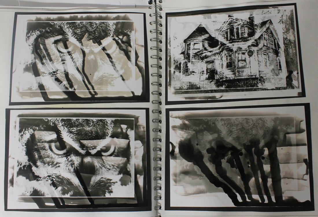
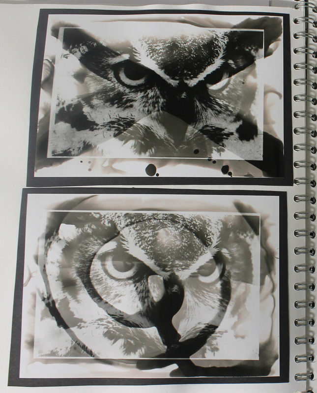
The top contact print on this side was a completely different experiment to the others that I have been doing within this section. I decided to try and overlay two different images to create a completely different outcome to anything that I have produced before. I chose to overlay an eerie and run down house on top of my original image of the owl to create a contrasting scene: in a sense, the two images work well together and the piercing and evil looking stare of the owl matches the creepy atmophere that the image of the house brings to this piece. I also like how the general wash of the page with the developer on a paintbrush has accentuated the atmosphere that I have tried to create within this image, allowing the slight drips to go off onto the edge of the page and develop those areas slightly more.
The second contact print on this side developed too much through my experimentation process and the final outcome was too dark. As you can see I tried to use a similar method and the image to the left with painting the horizontal lines and letting the developer drip down in vertical lines but I used too much developer which created this dark and over-developed image. The drips that are running down the page have turned black as the developer was on the page for too long. If I were to do this design again I would ensure that I put the image in the stop bath much sooner. |
|
After the experimentation with patterns and textures that I created above I decided to use shapes that were painted onto the photograph with developer to create some more interetsing outcomes. The first shape that I decided to use was a cross: I did a light wash of the image first so that some detail on the image could be seen and I then painted a cross through the centre of the image with a lot of developer to create this darker shape that the viewers attention would be drawn to. I think that this method worked really well as the shape is easily distinguishable from the rest of the image and shows off a lot of the detail within the shape of the cross. I paticularly like the effect that the excess developer gave the edges of the image, creating that burnt looking effect along with some small drips that had been dropped onto the bottom of the page through the process.
I then went on to use the spiral shape again as I was dissapointed with the last outcome when I attempted to use a similar method. This time I used less developer on the brush then last time so I could ensure that the pattern came out through the developing process and I made long, distinguishable strokes with the brush to create the shape you can see. I think that this method worked really well the second time as the faded areas to the centre of the sprial allow the viewer to see the entire shape easily as well as to see the detail in the image itself. I also like how the image seems to fade more as the spiral moves out towards the edge of the page and the detail that the developer has created along the edges of the paper adds another element for the viewer to look at along with the other texture that has been added to the final outcome. |
This is the last contact print that I created with the image of the owl so I incorporated all of my favourite developing processes into the one image: this meant that I used the paintbrush to flick the developer onto the image to create the small dots on the top portion of the image and I painted some of the developer on the bottom of the image and allowed it to run down the page, developing the photograph on its way. I also used the paintbrush to apply a lot of developer to the centre of the image by dipping it in the developer and allowing it to drip onto the middle of the image. This technique meant that I was then able to tilt the image and move the developer around the paper to create the softer lines you can see in the centre of the image rather then the harsher lines that painting the image would have caused. I like the final outcome of this image: the mixture of patterns and textures that I have created give the viewer various focus points to look at and by exposing the centre of the image through my development methods I have exposed the eyes of the owl and they have become the focus point of the image, looking directly at the viewer and creating the eerie atmosphere that is in many of my other contact prints.
DEVELOPMENT PROCESS - CONCLUSION:
|
In conclusion to this part of my project, I have found that I enjoy using the traditional dark room method of contact printing: I enjoy the original technique of placing the entire image into the developer to create an evenly coloured image but I also enjoy experimenting with different ways of applying the developer to create the interesting patterns, textures and shades of colour that you can achieve.
My favourite way to develop an image through this method is to use a paintbrush to drip the developer onto the image and allow it to drip down the page, developing the image as it moves. This is the method that I have use in the contact print to the left. I love the lines that this method creates, how each of them is a different shade to the other and the small dots and splodges that flicking the developer onto the paper creates. The precision that this method gives you is a brilliant aspect of developing images in this way. You can choose what part of the image you want to expose for the viewer to see and you can add the patterns around this part of the image by using different application methods with the paintbursh. This is one of my favourite photography methods as it allows me to be as creative as I want in terms of the final appearance of the image and the outcome almost always pleases me. I aim to use this method more within my photography, allowing me to develop my skills along the way. |
