INKODYES (LUMITYPES):
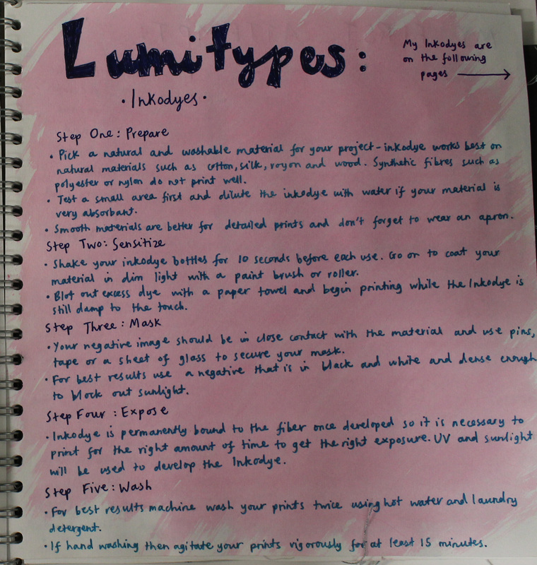
Step One: Prepare.
- Pick a natural and washable material for your project - inkodye works best on natural materials such as cotton, silk, royon and wood. Synthetic fibres such as polyester and nylon do not print well.
- Test a small area first and dilute the inkodye with water if your material is very absorbant.
- Smooth materials are better for detailed prints and don't forget to wear an apron.
- Shake your inkodye bottles for 10 seconds before each use. Go on to coat your material in dim light with a paint brush or a roller.
- Blot out any excess dye with a paper towel and begin printing while the Inkodye is still damp to the touch.
- Your negative image should be in close contact with the material and use pins, tape or a sheet of glass to secure your mask.
- For best results use a negative that is in black and white and dense enough to block out sunlight.
- Inkodye is permanently bound to the fiber once developed so it is necessary to print for the right amount of time to get the right exposure. UV and sunlight will be used to develop the Inkodye.
- For best results machine was your prints twice using hot water and laundry detergent.
- If hand washing then agitate your prints vigorously for at least 15 minutes.
My Experimentation:
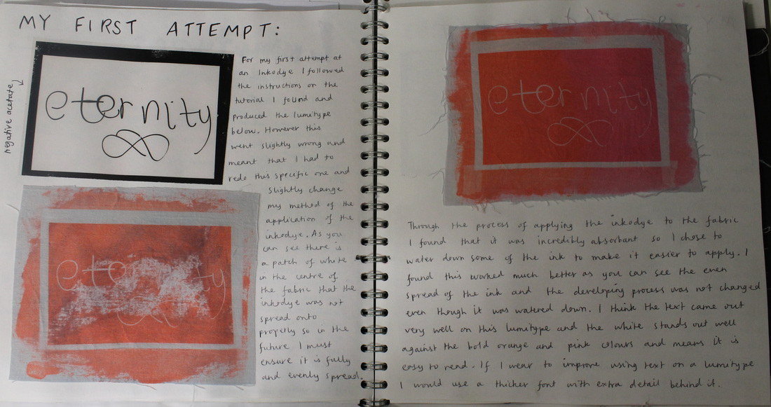
For my first attempt at an Inkodye I followed the instructions on the tutorial I found and produced the Lumitype below. However this went slightly wrong and meant that I had to redo that specific one and slightly change my method of the application of the inkodye fluid. As you can see there is a patch of white in the centre of the fabric that the inkodye was not spread on to properly so in the future I must ensure it is fully and evenly spread. Through the process of applying the inkodye to the fabric I found that it was incredibly absorbant so I chose to water down some of the ink to make it easier to apply. I found this worked much better as you can see the even spread of the ink and the developing process was not changed even though it was watered down. I think the text came out very well [it is not as clear in the photograph of my work] on this Lumitype and the white stands out well against the bold orange and pink colours and means it is easy to read. If I were to improve using text on a Lumitype I would use a thicker font with extra detail behind it.
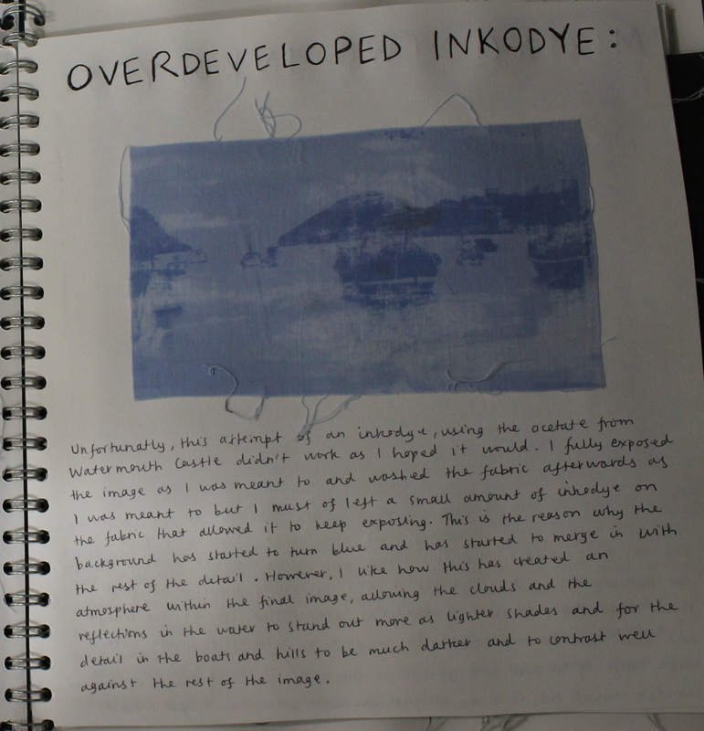
Unfortunatly, this attempt of an inkodye, using the acetate from the Watermouth Cove didn't work as I hoped it would. I fully exposed the image as I was meant to, following the instructions above, and washed the fabric afterwards as I was meant to but I must of left a small amount of Inkodye on the fabric and it allowed it to keep exposing. This is the reason why the background has started to turn blue and has started to merge in with the rest of the detail. However, I like how this has created an atmosphere wihtin the final image, allowing the clouds and the reflections in the water to stand out more as lighter shades and for the detail in the boats and hills to be much darker and to contrast well against the rest of the image.
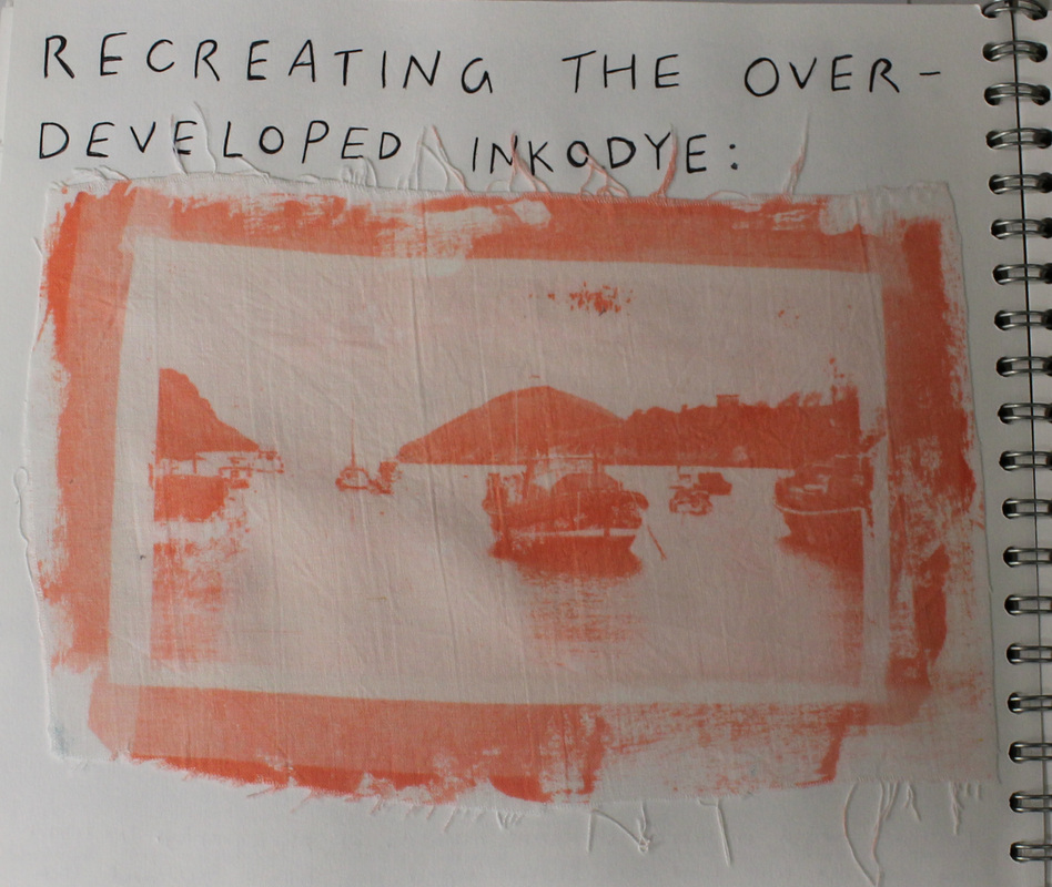
This attempt at the Inkodye I produced based on the Watermouth Cove acetate worked much better then the one above. I found that the orange Inkodye worked much better then the blue Inodye and allowed me to get a crisp version of the image at the same time as getting the sharp contrast against the deep orange colour and the white of the fabric. The tones and shadows that showed up in the sea were not visible in the previous attempt so I am happy with the final result of this one. To improve I would try to overlay another textured acetate of the sea on the bottom half of the image to try and get a heavily textured bottom to add detail and definition to the final piece.
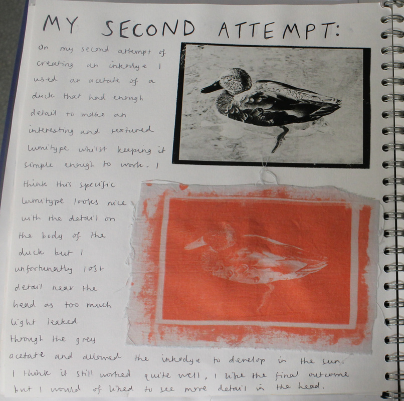
On my second attempt of creating an Inkodye I used an acetate of a duck that had enough detail to make an interesting and textured lumitype whilst keeping it simple enough to work. I think this specific lumitype looks nice with the detail on the body of the duck but I unfortunatly lost detail near the head as too much light leaked through the grey acetate and allowed the Inkodye to develop in the sun. I think it still worked quite well, I like the final outcome but I would of liked to see more detail in the head.
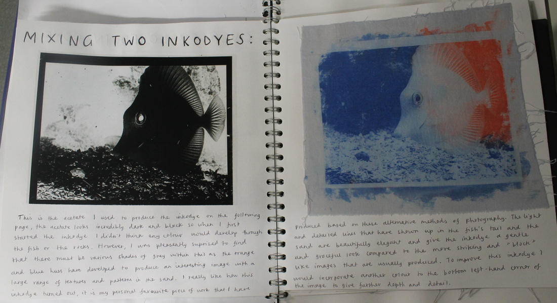
This is the acetate I used to produce the Inkodye on the following page, the acetate looks incredibly dark and black so when I first started the Inkodye I didn't think any colour would evelop through or fish or the rocks. However, I was pleasently suprised to find that there must be various shades of grey within this as the orange and blue have developed to produce an interesting image with a large range of textures and patterns in the sand. I really like how this Inkodye turned out, it is my personal favourite piece of work that I have produced based on these alternative methods of photography. The light and detailed lines that have shown up in the fish's tail and the sand are beautifully elegant and give the inkodye a gentle and graceful look compared to the more striking and "block" like images that are usually produced. To improve this Inkodye I would incorporate another colour into the bottom left-hand corner of the image to give further depth and detail.
